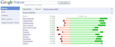
OBIEE - BI Answers has limited set of data visualization capabilities. We may see some radical improvements in this area in the coming releases of OBI EE. However, there's a feature in BI Answers which is seldom used - "Narrative View". The power of Narrative View comes from it's capability to render output as HTML (and javascript). This opens up ample of opportunities to create custom visualization of data.
Above we created a report using BI Answers which tells the % of companies trading below -2% of its previous close and so on so forth. There's no built in capability in BI Answers to visualize the data like the Goolge Finance chart. However, using Narrative View we can create the same very easily with little HTML code. Note: Narraive view denotes columns using numbers. E.g. @1 for first column.
In the BI Answers result tab, navigate to Other View > Narrative as shown below.

Narrative View UI has four main textboxes. The text/HTML inside prefix textbox is rendered first (only once). the text/HTML inside Narrative textbox is rendered for each row. The text/HTML inside Postfix textbox is rendered in the end (only once).

In the Prefix textbox add following HTML. This will create title for our chart. We also open a table tag for our chart HTML
<table cellspacing=0 cellpadding=20 style="border:1px solid #999999">
<tr>
<td style="font-family:Tahoma,Arial; font-size:14px;" valign="middle" align="left">Sectoral Performance</td>
</tr>
<tr><td>
<table cellspacing=0 cellpadding=0>
In the Narrative textbox add following HTML. This HTML will be rendered for each row in the report. Note: Use of % values in report for the width property and background color of the DIV tag.
<tr>
<td style="width:100px;font-family:Tahoma,Arial; font-size:12px;">@1</td>
<td style="border-right:1px solid #999999; width:300px; height:30px">
<div style="float:right;background-color:#F69788;width:@4;height:12px;font-size:10px;"></div>
<div style="float:right;background-color:#ED1A3B;width:@5;height:12px;font-size:10px;"></div>
</td>
<td style="width:300px;height:30px">
<div style="float:left;background-color:#C5DE89;width:@2;height:12px;font-size:10px;"></div>
<div style="float:left;background-color:#A6CE39;width:@3;height:12px;font-size:10px;"></div>
</td>
</tr>
In the Postfix textbox we will close the table tag for chart. It also has additional markup to show chart legends.
</table>
</td></tr>
<tr><td align="left">
<table border=0 cellspacing="0" cellpadding="5">
<tr>
<td style="font-family:Tahoma,Arial; font-size:12px;" valign="middle">
<div style="background-color:#ED1A3B;width:8px;height:8px;font-size:1px;"></div></td>
<td style="font-family:Tahoma,Arial; font-size:12px;" valign="middle">Less than -2%</td>
<td style="font-family:Tahoma,Arial; font-size:12px;" valign="middle">
<div style="background-color:#C5DE89;width:8px;height:8px;font-size:1px;"></div></td>
<td style="font-family:Tahoma,Arial; font-size:12px;" valign="middle">Between 0% and 2%</td>
</tr>
<tr>
<td style="font-family:Tahoma,Arial; font-size:12px;" valign="middle">
<div style="background-color:#F69788;width:8px;height:8px;font-size:1px;"></div></td>
<td style="font-family:Tahoma,Arial; font-size:12px;" valign="middle">Between 0% and -2%</td>
<td style="font-family:Tahoma,Arial; font-size:12px;" valign="middle">
<div style="background-color:#A6CE39;width:8px;height:8px;font-size:1px;"></div></td>
<td style="font-family:Tahoma,Arial; font-size:12px;" valign="middle">More than 2%</td>
</tr>
</table>
</td></tr>
</table>
Finally, don't forget to select the checkbox "Contains HTML Markup". Save the report and place it on the dashboard. This is how it should look. Tabular view can be removed if not needed.


Nice one!
ReplyDeleteThanks for sharing!
Regards
John http://www.obiee101.blogspot.com/
Information is very useful indeed.
ReplyDeleteThanks for blogging.
Regards
Srinidhi Rao, Sheffield